UTA is celebrating Accessibility Day!
Colleges and departments are communicating with the campus about the importance of accessibility topics! To join the fun, EIR Accessibility has teamed with Web Hosting Services to bring you ten accessibility tweaks that you can make to your website.
10. Ensure your site’s text is easily readable/scannable.
Here are a few quick readability tips:
- Avoid long sentence and paragraph structures.
- Keep things concise with three to five sentences per paragraph.
- Use bullets or numbering appropriately to better segment information.
- Use tables for tabular data but not to structure page content.
- Use images and headers appropriately.
9. Be cautious about using flyers and documents as "content.”
Many University departments create flyers to advertise and convey information. When using flyers on your website, include the flyer content as on-page text that a screen reader can scan.
When attaching a downloadable flyer in addition to the on-page content, use an accessible PDF instead of a jpg or gif.
8. Be sure your site can be navigated via keyboard.
Many assistive technologies like screen readers rely on users to tab through a website using a keyboard. If you cannot tab through each element on a page, you may have an issue with accessibility.
7. Make your links unique, with descriptive names, and that stand out from other text.
- Make all links clearly distinguishable from the surrounding text. Links should be a different color, underlined, or otherwise set apart.
- The link https://www.uta.edu/accessibility/eir/news is a great example of this as Sitecore websites are already styled to do this!
- Use text that properly describes where the link will go and be sure to lead with key information about the link. Just as you may scan a page for information, users of screen readers often scan pages for relevant links.
- Having links that are duplicated, aren’t clear in their meaning, or are frankly using “click here,” are not helpful for someone trying to navigate a page.
Pro Tip: Often, you’ll see a link that reads, “Click here for our flyer” or just “Click here.” A better alternative might be to say, “To find out more about our event, here’s a great flyer you can share with others.”
6. Ensure proper use of page headers in your content.
Screen readers use heading structure to navigate content. Keep the correct order of headings (<h1>, <h2>, etc.) and separate presentation from structure (how things look vs. how things are read/scanned). By using headings correctly and strategically, the content of your website will be well-organized and easily interpreted by screen readers.
Don’t pick a header just because it looks good visually. This may confuse screen readers. Be sure to use headers in order and style your text with CSS instead.
<h1> Main Heading </h1>
<h2> Sub Heading </h2>
<h3> Sub Sub Heading </h3>
<h2> Sub Heading </h2>
<h3> Sub Sub Heading </h3>
<h3> Sub Sub Heading </h3>
<h4> Sub Sub Sub Heading </h4>
Pro Tip: In the same way, search engines navigate your website via headers. Meeting accessibility needs may help your Search Engine Optimization (SEO).
5. Add transcripts and captions for audio and video content.
Transcripts and captions make audible content accessible to people who can’t hear, and more comprehensible to everyone. Be aware, though, that adding accessibility features to media requires planning and time.
Additionally, transcripts and captions are a great learning aid and can improve comprehension.
Pro tip: Make sure your PowerPoint presentations are correctly captioned and have notes/transcripts available as well.
4. Don’t use “only color” or “only images” to convey information.
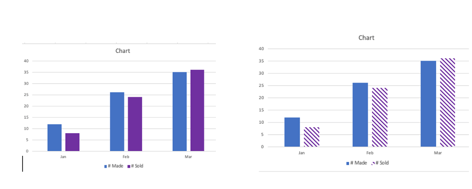
Color allows us to express emotions and communicate messages on the web, but don’t use color alone. Content, images, video, all contribute to a user’s experience. Be sure to display your content thoughtfully.
As well, different people have different learning abilities, and the use of color and multimedia ensures that your content will be useful to the widest range of people. If you have some time, check out this lecture by Dr. Kevin Elder. He gives educated advice on what color blindness is and ways you can be more inclusive when using color in your designs.
3. Use colors carefully.
Some users may have difficulty seeing text if the contrast between colors is low. Use colors that have a high contrast ratio, such as black and white or black and yellow, instead of low contrast combinations like yellow and white.
Check out some quick tips for designing for color blindness by Yellowchalk Design for great examples of why this is so important.
2. Always assign alt tags for images.
You should provide alt text for each image on your site, so that people using screen readers can understand your message and the importance of the images you use.
Keep your alt tags short, direct, but descriptive enough to convey the image. Most alt text should be no more than a few words long, using simple language.
Pro tip: Use alt text for buttons and title text for document links.
1. ... and our top accessibility tweak for your website is... Embrace Siteimprove.
Never assume your website is accessible to all users. UTA provides Siteimprove to assist you in quickly evaluating the overall accessibility of your website.
For additional questions about Siteimprove or accessibility in general, email accessibility@uta.edu.
